Market researchers are a descriptive bunch – we like to say what’s happening and show the evidence. That’s important, but researchers also aspire to be great partners and strategic consultants who can delve through the research data and find the unexpected ‘wow’ moments by seeing the non-obvious insights hidden in the data.
HumanListening is a leader in Qualitative AI globally – our specialty is integrating the benefits of qualitative and quantitative insights coupled with analytics. Our heritage as researchers means we aspire to go beyond the descriptive and consistently reveal those ‘wow’ moments. Our AI lab has just rolled out Impact Maps - the latest fusion of research know-how and AI Analytics.
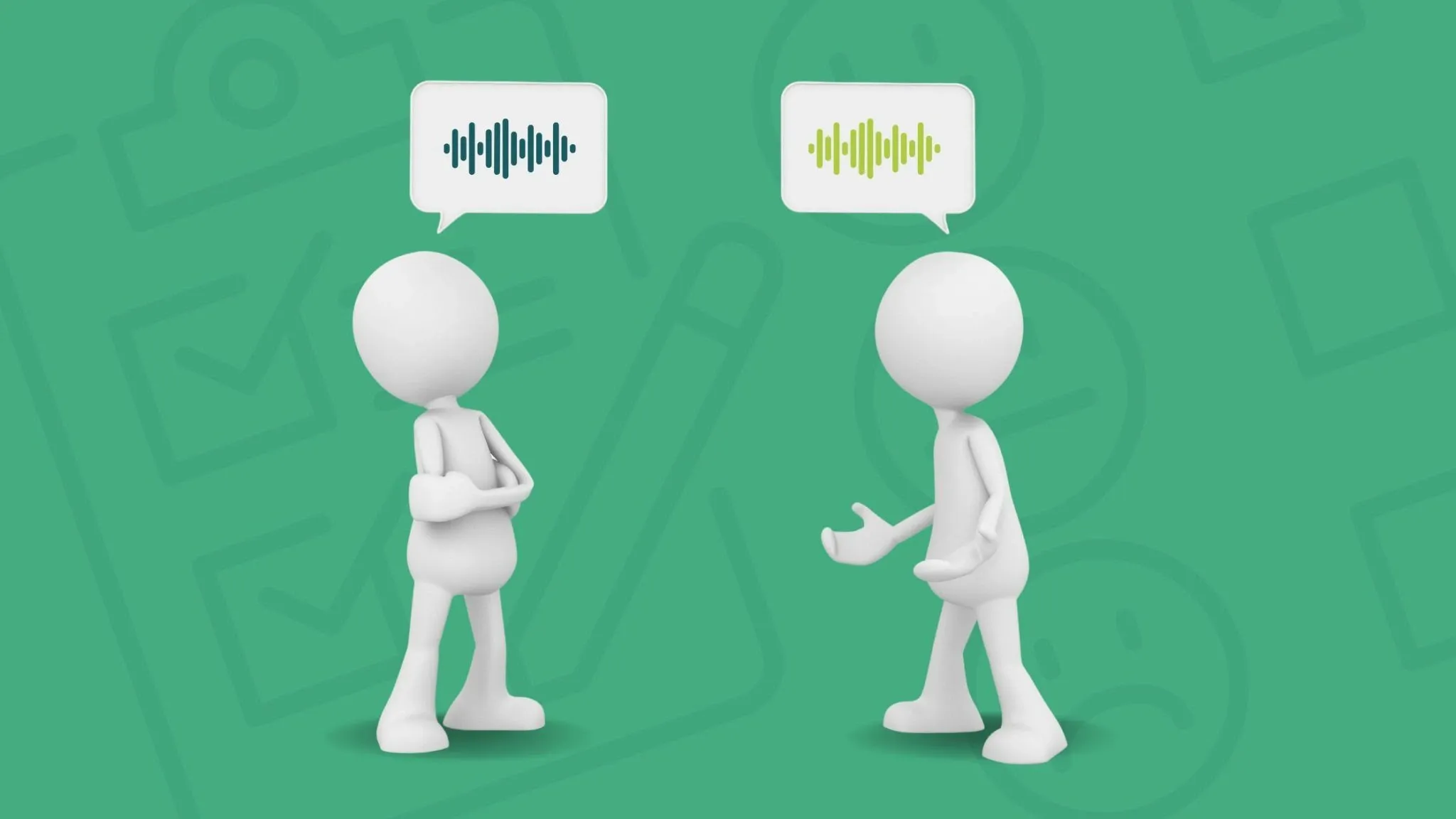
Going from what to why
We run hundreds of Qual AI projects in the HumanListening platform every month. Using advanced AI-powered analytics, we can generate auto-reports that quickly and accurately summarise those conversations.
Now with Impact Maps, we’ve transcended descriptive analysis to deliver ‘wow’ through ‘why’. First let’s have a look at an Impact Map from a recent study we conducted about quick serve restaurants…
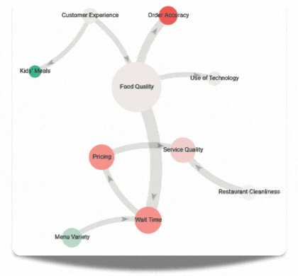
Here’s how to read it:
- The bubbles are the things people are talking about – a bigger bubble means more people mentioned it
- The colour is the sentiment: red = negative, green = positive, grey = neutral
- The arrows joining the bubbles show the direction of impact and strength of relationship between the topics (wider arrow means stronger relationship)
- Hovering over bubbles or arrows cause summaries to appear. These describe what respondents said about the topic and how one topic impacts another. You’ll have to request a demo to see this functionality!
Underneath this visualisation sits a complex set of algorithms and AI analytics that builds the map from your data set. The visualisation works brilliantly to surface and describe unexpected insights in a simple and immediately relatable way. It achieves this by mastering what the human mind struggles with – synthesising large and complex data sets and modelling the hidden relationships within them. Impact Maps gives you a more realistic understanding of humans and their feedback by acknowledging cause and effect as a complex non-linear set of relationships.
Back to our QSR example, we discovered from this analysis that:
- Food Quality was the most mentioned topic and heavily impacted Wait Time and Order Accuracy
- Wait Time influenced Pricing, with delays amplifying dissatisfaction with rising costs
- Restaurant Cleanliness influenced Service Quality, where clean spaces were linked to better staff behavior and efficiency.
- 95% of mentions about kids' meals were positive. Many praised the Happy Meal for its toy and food options.
So Impact Maps look great, they help find ‘wow’ insights, and frankly, are fun to play with.
But there are also many real-world use cases:
- Identify what is driving customer experience across multiple channels and define the three most impactful actions you can take to improve experiences
- Increase your product market share by identifying the drivers of product usage and decision making
- Create winning brands by exploring how tangible experiences and intangible beliefs form strong emotional attachment
- Understand human experiences and identify latent needs and opportunities you can feel through new product development
Best of all, this new technology, based on conversations with our qualitative AI moderator, EVE, is founded on a more positive and engaging respondent engagement – no more 30-minute surveys when you can get better and more insightful outcomes with a 5-minute discussion.